Lesson 26: Displaying Images
As a farmer I would like to upload pictures, with dates and descriptions, to track my crops' quality by their appearance over time.
Lesson Outcomes
By the end of this lesson you should:
- Know how to add a gallery widget to your view XML
- Know the data model requirements for providing the gallery with a collection source
- Know how to filter and sort your gallery images
- Be familiar with the gallery widget's behaviour in terms of user experience
The second and third topics in this list contain nothing new to learn. We simply cover an example of how you would go about providing, sorting and filtering images using methods covered in previous lessons so that, after this lesson, you would have seen that the gallery widget requires nothing special or unique to the widget to accomplish this.
Scenario
We want to provide our farmer users with a feature to track the growth and quality of their crops over time. For this we'll add a new category to the Farmer Profile page, linking to a new page with, amongst other things, a gallery widget to display the farmer's photographs as thumbnails, filtered on the type of crop and sorted according to their dates. To upload the pictures, we'll provide the <fileupload> widget as described in lessons 9 and 11.
New & Modified App Files
./model/objects/CropQualityPicture.mez
./model/roles/Farmer.mez
./web-app/lang/en.lang
./web-app/presenters/farmer_profile/FarmerProfile.mez
./web-app/presenters/farmer_profile/FarmerProfileMenu.mez
./web-app/views/farmer_profile/FarmerProfileMenu.vxml
./web-app/views/farmer_profile/FarmerProfileCropQualityPictures.vxml
Widget Overview
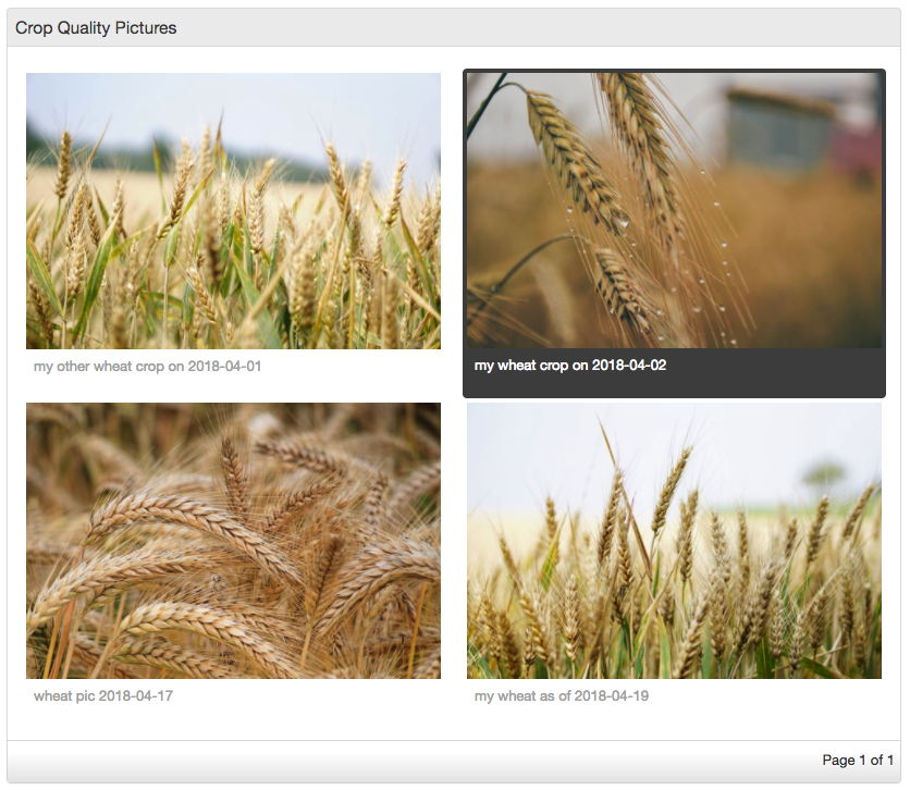
The gallery widget will display an image as a resized thumbnail with a caption underneath. It will arrange multiple thumbnails in a grid of up to nine images per page. If there are more than nine images for the gallery to display, paging links will appear at the bottom of the widget to navigate between the pages. Thumbnail size varies according to the number of thumbnails being displayed, and will fill the available widget space. In other words, a single image in the collection source will fill the widget area, while five or more images will display at the smallest thumbnail size.
A gallery is given a collection source in the view XML using the familiar <collectionSource> child element. This collection must be of a custom object that has a blob attribute for the image, specified by imageAttribute="..." in the parent XML. You can also specify a string attribute to be used as the image caption by providing descriptionAttribute="...".
Clicking on a thumbnail will select or deselect an image (a selected thumbnail container will have a dark gray background), which, for the purposes of DSL logic, shows which image is bound to the specified binding variable (see code snippet below).
You can double-click on a thumbnail to view the image full-size (or your screen size limit), and you can hover over a long caption to display the full caption in a tooltip pop-up.
Adding a Gallery Widget
We'll add the gallery in a new view as follows:
<gallery title="gallery_title.farmer_crop_quality_pictures" imageAttribute="image" descriptionAttribute="description">
  <collectionSource function="getFarmerCropQualityPictures"/>
  <binding variable="selectedCropQualityPicture"/>
</gallery>
The function getFarmerCropQualityPictures returns a collection of a new object called CropQualityPicture.
CropQualityPicture[] getFarmerCropQualityPictures() {
  return CropQualityPicture:relationshipIn(farmer, farmer);
}
persistent object CropQualityPicture {
  date pictureDate;
  string description;
  blob image;

  @ManyToOne
  Farmer farmer via cropQualityPictures;
}
Add the functionality for uploading gallery images on the same view as follows:
<fileupload label="fileupload.upload_new_crop_picture">
  <binding variable="cropQualityPicture">
    <attribute name="image"/>
  </binding>
</fileupload>
Also add a <datefield> for cropQualityPicture.pictureDate and a <textfield> for cropQualityPicture.description.
We'll also add basic edit and delete buttons (and their required DSL logic) for the newly created objects. See the attached source code if you're uncertain about this step.
Upload a few pictures. Afterwards your gallery widget should look something like this:

Filtering and Sorting Gallery Images
In order to filter on the crop type, we add a relationship to the CropQualityPicture object:
@ManyToOne
Stock cropType via CropQualityPictures;
So that we can change the collection getter function to:
CropQualityPicture[] getFarmerCropQualityPictures() {
  if (cropPictureFilter == null) {
    return CropQualityPicture:relationshipIn(farmer, farmer);
  } else {
    return CropQualityPicture:and(relationshipIn(farmer, farmer),
        relationshipIn(cropType, cropPictureFilter));
  }
}
Also add a <select> widget for selecting the cropPictureFilter. For this to work, the farmer's crops must be added to his/her profile (feature already available via Farmer Profile since Lesson 8).
Next we'll sort according to the date on the object:
CropQualityPicture[] getFarmerCropQualityPictures() {
  CropQualityPicture[] result;
  if (cropPictureFilter == null) {
    result = CropQualityPicture:relationshipIn(farmer, farmer);
  } else {
    result = CropQualityPicture:and(relationshipIn(farmer, farmer),
        relationshipIn(cropType, cropPictureFilter));
  }
  result.sortAsc("pictureDate");
  return result;
}
These should be familiar patterns by now. The important thing to see is that you order and filter for the gallery widget using DSL logic before sending the collection to the widget. There is currently no filtering or sorting features built into the gallery widget itself.
Other Resources
Attached here are some free stock photos, including the examples used in this lesson.