- Created by Former user, last modified by Jacques Marais on Aug 16, 2023
You are viewing an old version of this page. View the current version.
Compare with Current View Page History
« Previous Version 40 Current »
As a System Administrator I want to view a list of System Administrators.
Lesson Outcomes
We'll now start working towards managing our "System Admin" users in-app (with the role privileged to do so being itself a "System Admin" since it's highest in the hierarchy). First we want to see who we have in the system already, so we'll display them in a table. We'll then demonstrate interaction with specific rows in the table widget, which in this lesson will be navigating to a view showing the selected user's details.
Other widgets used in this lesson:
<button><action>
New & Modified App Files
./web-app/images/people.png
./web-app/lang/en.lang
./web-app/presenters/SystemAdminUserMgmt.mez
./web-app/views/SystemAdminUserDetails.vxml
./web-app/views/SystemAdminUserMgmt.vxml
Adding Another View
This new view also needs to be accessible via the menu, so we add a new view and a new <menuitem> precisely as in Lesson 1, except with a different view label and menuitem label:
<?xml version="1.0" encoding="UTF-8"?>
<ui xmlns="http://uiprogram.mezzanine.com/View"
    xmlns:xsi="http://www.w3.org/2001/XMLSchema-instance"
    xsi:schemaLocation="http://uiprogram.mezzanine.com/View View.xsd">
    <view label="view_heading.system_admin_user_management" unit="SystemAdminUserMgmt" init="init">

        <menuitem label="menu_item.system_admin_user_management" icon="UserProfile" order="1">
            <userRole>System Admin</userRole>
        </menuitem>
    </view>
</ui>
view_heading.system_admin_user_management = System Admin User Management
menu_item.system_admin_user_management = System Admin User Management
Collection Variables and Selectors
Even though at this point we have only one "System Admin", we'll be working with a collection variable - i.e. an array of entities - to cater for when we add more. Collections are covered more in-depth in Lesson 8, but for now take note of how it is declared and of the all() function used to populate this collection from the database.
unit SystemAdminUserMgmt;
SystemAdmin[] systemAdmins;
void init() {
	systemAdmins = SystemAdmin:all();
}
We refer to all() as a "selector", and it is one out of many such selectors you have available in lieu of SQL select queries. These are persistence built-in functions (BIFs) accessible from the object's namespace, e.g. SystemAdmin. For the full list of selectors, consult the DSL Reference.
These BIFs can be used to build up a complex selector for reading sets of data from the persistence layer, and there will be examples of this as the tutorial code gets more complex. Here's a short example of the syntax you can expect to see in the near future:
activeSystemAdmins = SystemAdmin:and(equals(deleted, false), greaterThan(lastActive, lastActiveCutoffDate));
Adding a Simple Table Widget
Add a <table> widget beneath the <menuitem> tags:
<table title="table_title.system_admins">
	<collectionSource variable="systemAdmins"/>
	<column heading="column_heading.first_name">
		<attributeName>firstName</attributeName>
	</column>
	<column heading="column_heading.last_name">
		<attributeName>lastName</attributeName>
	</column>
</table>
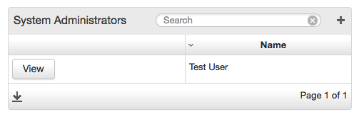
The first child element is <collectionSource>. It contains a data source attribute that is either a variable or a function (in our case the former, which we declared above) which contains or returns a collection variable. After that we can add any number of columns (with a heading attribute, for fetching a heading from the lang file). The <column> element gets an <attributeName> child element that specifies which field on the object is to be displayed in that column. The above gives you:

The <table> widget's child elements need to be in a certain order to compile successfully, with the <collectionSource> first, then the <column> elements.
More <attributeName> Children per Column
We can compact our table a little by putting more than one <attributeName> under a single parent <column>:
<table title="table_title.system_admins">
	<collectionSource variable="systemAdmins"/>
	<column heading="column_heading.name">
		<attributeName>firstName</attributeName>
		<attributeName>lastName</attributeName>
	</column>
</table>
Helium will automatically concatenate the values and separate them with spaces.
Adding a View Button to Act on a Table Row
The <table> widget has an optional <rowAction> child element that adds a button to every row in the table. Consider a scenario where we do not want to display all of an object's fields in a summary table, and instead allow the user to click to navigate to a detail page.
<table title="table_title.system_admins">
	<collectionSource variable="systemAdmins"/>
	<column heading="column_heading.name">
		<attributeName>firstName</attributeName>
		<attributeName>lastName</attributeName>
	</column>
	<rowAction label="button.view" action="viewUser">
		<binding variable="selectedSystemAdmin" />
	</rowAction>
</table>

The action attribute binds to a function (viewUser) in the presenter unit specified for this view (SystemAdminUserMgmt). (It could also have bounded to a function in a different presenter - then it would have been entered as action="OtherUnit:viewUser".) This function can contain any amount of logic you need, but in our case we'll simply use it to navigate to a different view, which we'll get back to in a second.
The binding child element specifies the variable to which the selected record binds. It's how we obtain a handle on the user's selection. Clicking on the button does the assignment. Of course, the type of this variable must be of the same type as the collection source used to populate the table:
SystemAdmin[] systemAdmins;
SystemAdmin selectedSystemAdmin;
More table features will be highlighted in the following lessons once we have populated it with more than one object.
Basic Navigation
As mentioned in the section above, the "View" button is linked to the viewUser function, which we'll use to navigate to a new page. In order to do so, viewUser needs to return a member value from an enumerated type called DSL_VIEWS, which contains the names of all your views. Helium will automatically generate this enum when you run your app. (Although not used in this lesson, returning null where you would otherwise return a member of DSL_VIEWS keeps you on the same page.)
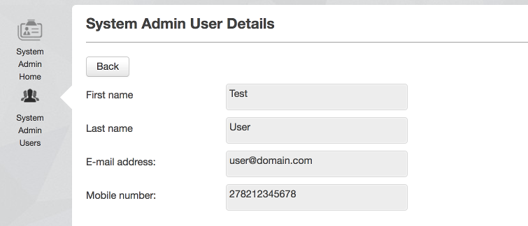
The first step is to create the user details view, this time without the <menuitem> widget because we don't want to navigate to it from the menu, only from this particular table. For this view's presenter we'll just use the same one linked to the view with the table. Simply add some <info> widgets as described in Lesson 1. Note we're using the selectedSystemAdmin variable specified earlier as the <rowAction>'s binding variable to retrieve the selected user's details.
<view label="view_heading.system_admin_user_details" unit="SystemAdminUserMgmt">
	<info label="info.first_name">
		<binding variable="selectedSystemAdmin">
			<attribute name="firstName"/>
		</binding>
	</info>
	(etc.)
Also note that if our current view binded to a different unit, i.e. not the same unit where selectedSystemAdmin was declared, we would have needed to specify the unit as well:
	<info label="info.first_name">
		<binding variable="SystemAdminUserMgmt:selectedSystemAdmin">
			<attribute name="firstName"/>
		</binding>
	</info>
If the new view is called SystemAdminUserDetails.vxml, we can now write our viewUser function in SystemAdminUserMgmt as:
DSL_VIEWS viewUser() {
	return DSL_VIEWS.SystemAdminUserDetails;
}
And clicking the button will load the page.
We would like to be able to return to the view from whence we came, so let's create a "Back" button with the <button> widget on the details page and bind it to a function returning DSL_VIEWS.SystemAdminUserMgmt:
<view label="view_heading.system_admin_user_details" unit="SystemAdminUserMgmt">
	<button label="action.back" action="back" />
	<info label="info.first_name">
		<binding variable="selectedSystemAdmin">
			<attribute name="firstName"/>
		</binding>
	</info>
DSL_VIEWS back() {
	return DSL_VIEWS.SystemAdminUserMgmt;
}

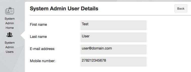
We can do one better. Helium's <action> widget positions itself in a spot more appropriate for navigating back, so we replace the <button> widget line with this:
<action label="action.back" action="back" />

Note that all button variants also support the confirm dialog box. This is especially useful when a button is used to perform a critical or sensitive operation where the user must be extra sure before executing the logic backing the button. For more details on confirm and how it can be used with the different types of buttons, see the reference documentation here for more details.
Clicking your browser's back button will not open the previous page in your DSL app. It will instead browse "back" to your location before opening your DSL app. Similarly hitting refresh will refresh for the whole app and not your particular app view.
Lesson Source Code
- No labels
0 Comments